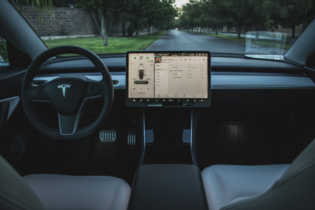
The Tesla Model 3’s interior is among the most radical and tech-centric in the market, featuring a minimalistic theme that is dominated by a 15-inch center touchscreen. With all the vehicle’s controls exclusively accessed through the touch display and a couple of scroll wheels on the steering wheel, the Model 3’s interior is also among the most polarizing.
During the vehicle’s unveiling, Tesla Chief of Design Franz von Holzhausen stressed that the vehicle’s interior is the most satisfying, innovative, and radical part of the Model 3. The designer added that the Model 3’s spartan interior is aesthetically pleasing and functional, and that it is designed to make the vehicle feel as spacious as possible. A notable number of Model 3 owners have attested to this.
Inasmuch as von Holzhausen’s words are accurate, the Model 3’s interior has also attracted a notable amount of criticism. Skeptics claimed that the Model 3’s 15-inch display is a distraction and a magnet for accidents, while others lamented the lack of physical controls like knobs, buttons, and switches on the vehicle.

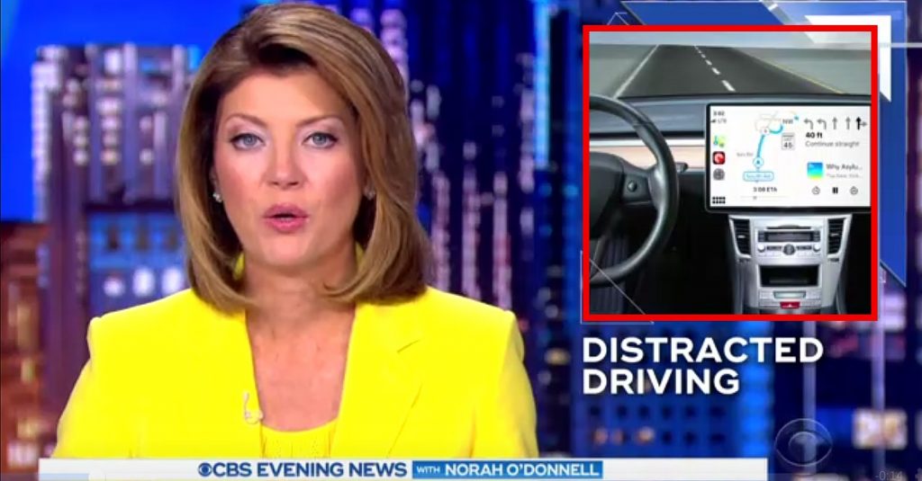
The graphic designers (or interns perhaps?) from CBS Evening News appears to belong solidly in the latter camp. During a recent segment with host Norah O’Donnell about the dangers of technology for senior drivers, the media outlet opted to use a graphic that depicted a very tech-heavy car interior. Interestingly, CBS’ vehicle of choice was the Model 3, which made sense considering the electric car’s technology.
Interestingly, CBS opted to give the Model 3 interior a bit of a facelift, by mixing it with what appears to be a center console from a 2010 Subaru Legacy. That way, the segment’s graphic of choice emphasized those big touchscreens found in vehicles today and, curiously, the buttons and knobs of a familiar, traditional center console. For good measure, CBS opted to overlay Apple CarPlay on the Model 3’s display as well.

The result of the Model 3-Subaru interior is strange, to say the least, and probably enough to get a few laughs (or a massive facepalm, perhaps) from Franz von Holzhausen. Nevertheless, one could at least appreciate CBS looking to Tesla’s interior design in its electric cars to represent the increasing amount of technology in vehicles.
Amusing graphics aside, CBS’s topic in its recent segment is a somber one. The segment was based on a recent AAA study, which noted that seniors are struggling with the technology being built into vehicles today. Nevertheless, a vital component of these touch displays is the user interface and how friendly it is for drivers. This is something that Tesla has steadily refined over the years, and it is one that the company continues to improve with each iteration of its in-car software. It is also something that some legacy carmakers have struggled with, as evidenced by the rather complicated menus in the Jaguar I-PACE that were called out by some reviewers of the all-electric vehicle in the past.
Watch an excerpt from CBS’s recent segment in the video below.

<!–
–>
var disqus_shortname = «teslarati»;
var disqus_title = «Tesla Model 3 interior gets photoshopped to look more traditional in CBS segment»;
var disqus_url = «https://www.teslarati.com/tesla-model-3-interior-conventional-car-console-cbs-video/»;
var disqus_identifier = «teslarati-110277»;

